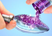
Colors affect your mood in ways that you aren’t aware of. Colors are used in public buildings, advertising and even in food in order to produce desired effects. The power of color to change our minds and bodies is a well studied subject, and the basis of many holistic therapies. The ways in which humans are affected by colors is complicated, however. Humans develop natural associations with different colors over the course of their lifetimes. These associations are driven by our natural surroundings as well as our cultures.
Cool Colors
Cool colors (blues, purples, greens) are known to relax the mind and spirit. Literally, these colors are known to slow metabolism, calming down those people who see them.
In the world of advertising, blue is not an attention-grabber (as in the case of the warm colors) and thus is not useful for making an immediate, high-impact impression. However, there are manufactured products that make frequent use of the color blue because of its association with cool temperatures, ice, water, clarity and cleanliness. Clear alcohol (such as vodka) and cleaning products make frequent use of the color blue in packaging and advertising. Because of its abilities to suppress excitement and impulsivity, blue is also associated with intellect, thoughtfulness and deep introspection. Blue is viewed as a sophisticated color, used to advertise cutting-edge technology. Gray-blues have a zen-like quality, promoting peace and calm. This color is frequently painted on walls in rooms where it is important for the occupants to feel calm (such as spas and doctor’s offices). Light gray-blue is also known as a “recessive color”, meaning that this color falls into the background. For this reason, light gray-blue paint is often used in interior decor to make smaller rooms seem larger, airier and more open. Finally, blue is an appetite suppressant, thus making it an unfavorable color for food and food products.
Green is associated with plant life, freshness and nature. Green is often used in modern times to symbolize respect for the environment. Green is frequently used in packaging for “green” (earth-friendly) products. Green is associated with healing, is said to be easiest on the eyes and is even believed to improve vision. Light, desaturated greens like sage and mint are used in interior decor to create calming, refreshing interiors. In the US, green is also the color of money and thus associated with cash, and sometimes wealth.
Purple is the color of royalty. In classical history, purple material could only be purchased by wealthy elite and nobility because it was so expensive (hence the color name, royal purple). Purple is not a common color in nature, but is seen in varieties of flowers, foods and animals. Perhaps because of this lack of association with any specific object in nature, purple is often seen as symbolizing spirituality and mystery. In the Chakra system, purple is associated with the “third eye”, and is closely tied with wisdom and spiritual inquiry. Shades of deep purple like plum and eggplant are common in living room and dining room decor, where sophisticated colors are appropriate. However, lighter, more child-like shades of purple are common in bedrooms for little girls.
How Warm Colors Affect your Mood
The warm colors (red, yellow and orange) are known to excite the mind and spirit. These colors are associated with fire and thus, warm temperatures. Each warm color has its own individual effect on humans.
Red is a stimulating, emotionally charged, exciting color. Its associations with blood, meat, love, lust, passion and anger all trigger very specific emotional responses in humans. In the western world, red is a color associated with romance and sex, and so gifts from one lover to another are often red (red roses, chocolates in a red heart-shaped box). Red is also used heavily in advertising because of its natural attention-grabbing qualities, and specifically in the food industry because the color red is known to be an appetite stimulant. This is so prevalent that in the US, carbon monoxide is used in the meat packing industry to prevent meat from turning brown over time. Red meat is more attractive to consumers and sells better. In interior design, red is more often used as an accent and less often as a dominant color in a room because it can be overwhelming for occupants. When red is used as the dominant color in a room, it is usually a darker, more sophisticated shade of red (the color of red wine).
Orange is a cheerful color that is highly noticeable. Orange is frequently used in roadsigns when special caution is warranted, such as in cases of road construction. It is a color of warning, but also a color associated with warm places on the globe, tropical heat, citrus fruit and good health. Deeper shades of orange are associated with autumn and coming harvest. It is the deeper shades of orange that most people prefer to use in interior decor, probably because these shades are less abrasive, more subtle and their associations with harvest seem to give them depth and significance.
Yellow is a bright, uplifting color, symbolizing the sun and a cheerful disposition. Yellow is actually the most visible of all colors, and is excessively stimulating to the eyes. Although yellow is seen as a primarily cheerful color, it tends to aggravate people when used in excess in interior design. This color is best used in small doses.
Although each person has their own personal associations and memories of each color of the rainbow, most people will share similar responses to the same colors. The next time you’re thinking about redecorating your house, advertising for an event, marketing a product, planning a meal, or buying a gift for a romantic partner, give strong thought to your color choices and how colors affect moods.


